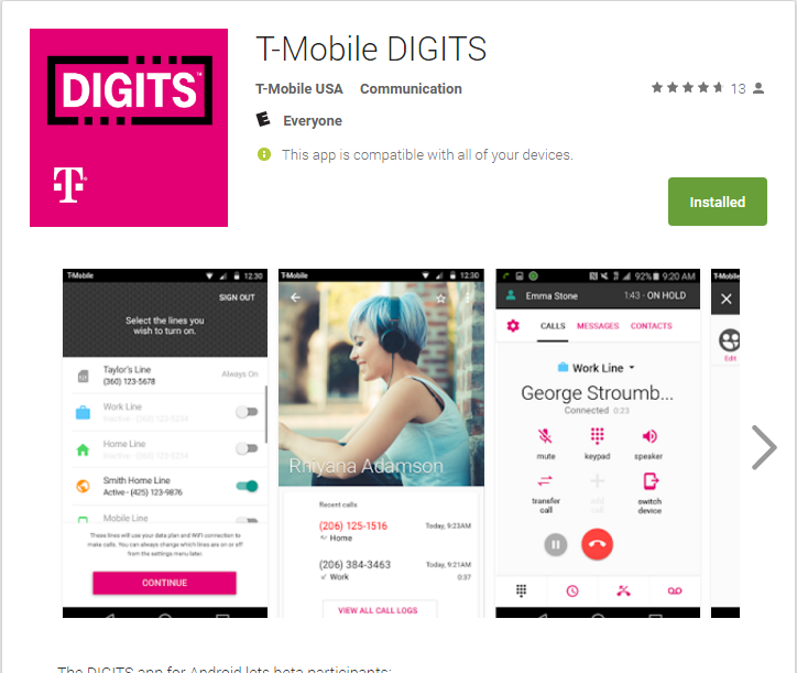
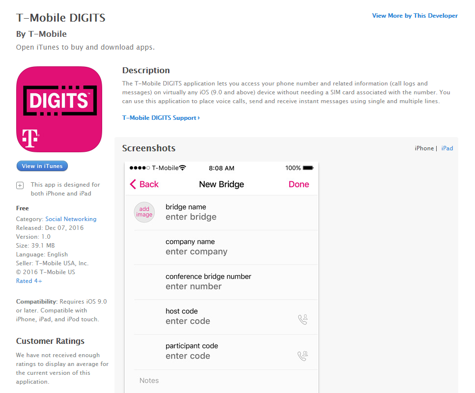
T-Mobile DIGITS
While working on a large team of designers in an agile development environment, it was my role to participate in ideation and brainstorming, and develop flows, wireframes, lo-fi and hi-fi comps, and deliver documentation for our cross-platform communications app. During my time on this project I was tasked with designing for iOS and Android, which meant using Apple's Human Interface Guidelines, and Google Material Design.
LET'S TALK PROCESS
Essential to any design project are initial sketches and chewing gum. In this rough sketch, I lay out a potential login screen.
This is a very simple example for a very simple task. When working with a team of about 14, it's important to standardize everything. In this simple flow, using agreed upon symbols, we see a flow title, screen names and numbers, user actions and more. You can imagine, when designing a cross-platform communications tool, some of the flows could get quite intricate.
Somewhat detailed wireframes were created to give the team a pretty good idea of where things should be placed, and fostered UX Design conversation. A wireframe would go through several iterations before moving onto documentation and lo-fi comps.
My team and I designed the look, worked through flows and discovery, but did not write the code. Since all of our design assets were being handed off to an engineering team, it was crucial to have uniform and accurate documentation. Because this was a communications app, it needed to adhere to all usability guidelines.
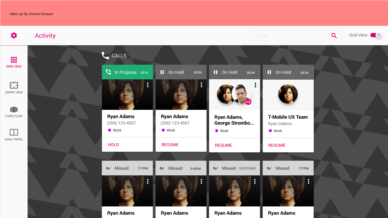
I explored what multi-tasking would look like in browser, at different sizes. We discussed functionality in twice-daily stand up meetings. Morning scrum and end of day wrap up.
When comps were approved and ready to send to engineering, they needed their redline documentation.
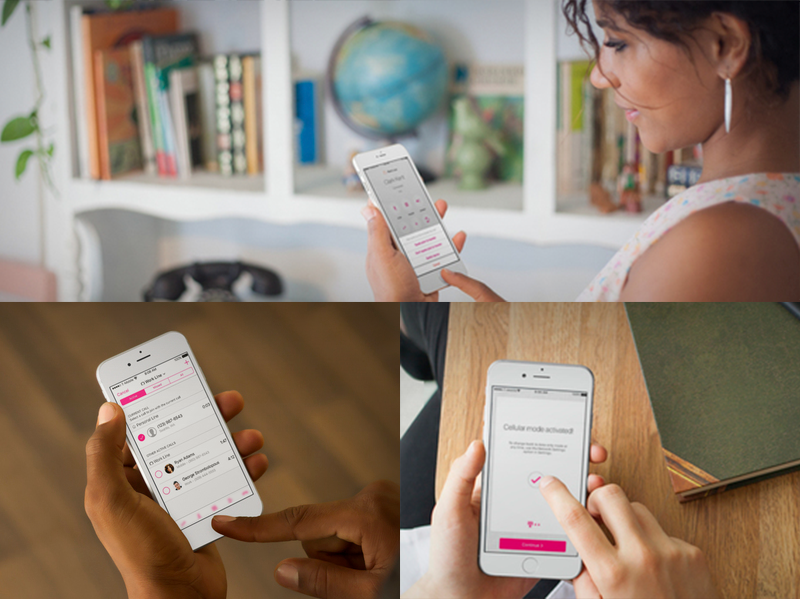
FINAL PRODUCT


